
Interior Design — How To Cosy Up A Small Living-Dining Room
Interior Design — How To Cosy Up A Small Living-Dining Room
 On http://houseandhome.com/tv, see Sarah Hartill and Stacey Smithers give a traditional space a bolder, more modern look. Learn their tips on how to enliven rooms using colour, artwork, fabrics and fresh accents.
Watch the next two segments from this episode at http://houseandhome.com/tv/episode/energized-living-dining-area-one-table-four-ways, along with hundreds of other segments!
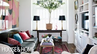
Too busy, crowded. Jam everything ‘vintage’ in there to make it classic? Hmm less is more
The thing that I loved the most was the salmon coloured floor lamp in the dining area, but I don’t think that they mentioned it.
The rooms are too staged for my taste. I want a space to feel like people live in it. I particularly disliked the art hanging in the front of the shelves. The proportions of the plant (the non-fig tree) made it an odd choice for placement up on a table, maybe the table could have been pulled out a bit and the tree could go on the floor between the table and the window, slightly over to one side.
Ugly light fixture in the dinning room, the sideboard area is too bland and white. The rest is good
so cluttered
Everything is just so big, makes the room feel cramped
I love the nice white bookshelves in the living room but I’m not at all a fan of the picture frames nailed blocking the shelves. Logically you would nail them to the wall. It takes away from the beautiful bookshelves which should be the focal point of the room. Talk about an eyesore. It looks ridiculously tacky.
🤪🤦🤷
Did she just say a “more bolder” look. Cringe
I hate the pictures hung on the front of shelves. No reader would do this (or have so few books, for that matter), and anyone who appreciates their artwork would be more careful of it.
Approached me. Objective case required after verb.
I love the living room, but for the wall shelf, I would love to put all my books in there, rather than hanging paintings off of it. Wall to wall of books, that’s heaven for me.
I love everything except that sofa/seater what ever you call it looks too pushed like we are going crazy everywhere why not here
I don´t think its small ;i think its beautifull !
Too many things in limited space. Cute idea but not with the implementation.
pretty one of my favourites simple yet elegant love the pastel colors
When you added the fourth item –a rose vase with the 3 items (2 lamps and 1 plant) it felt awkward. The odd # rule is there for a reason.
Love the Persian rug.
Hello there, camera person in the reflection of the painting! 😉
Not particularly enamored with the decor but I love that couch
The painting on the wall looks really nice. Can someone help me with steps for making a similar one?
These rooms are a lesson to all young women to only call your gay best friends and never call the sorority sisters who started a decorating business.
Overly cluttered, IMHO
“She approached Stacey and me,” not “Stacey and.I”
“She approached Sarah and me,” not “Sarah and I.”
How to know when to use “She” instead of “I”? You wouldn’t say, “She approached I.” You’d say, “She approached me.” Adding one person doesn’t change this. “Stacey and I decorated the space” is correct, since you wouldn’t say, “Me decorated the space.”
Why even bother having coffee tables if they’re so full of art books there’s no space for a cup? Aesthetically they did a great job, except the throw pillows cheapen the look of that beautiful sofa in my opinion
Boring
Nice
Too cramped, and the dining room table looks messy.
They hung paintings from the shelving so that Beth can never read any of her books again 🙁
For me this living room does what they set out to do. It’s cozy. It invites you to cuddle up and the two white chairs close down the area. They did a great job with the mirror and the buffet as well. The light above the dinning table is unusual but it adds to the organic, layered effect and makes it look like the rooms developed over time.
Beautiful
Nice!
Everything is great except for the two white chairs taking to much of the space
"She approached Sarah and I." Ugh! No. It’s: "She approached Sarah and me."
so where is the fig tree?
The furniture is too bulky imo. The two chairs separating the two rooms are suffocating.
Lose the fabric on the dining chairs and add a patterned drape!!!
Great, especially the artwork over the sofa
Heee…much stuff in a small place. I feel I would bump on furniture every time i try to move. I would the coffee table and buy a stand stable. I would definitely remove the two arm chairs that is creating blocking the entry if the room.
The settee makes the dining room too cramped and the light fixture is totally wrong. Not too crazy about a plant in a big basket sitting on a desk in the window either.
Table blocking the window, makes it look cramped & cluttered. 1lamp would be fine & just small side table. Tree looks odd on the table. Should be on floor to side of window. Very 90’s.
to many chachki.
Omg this is awful. Glad the homeowner likes it but it’s so cluttered and would make me feel so anxious ew.
@0:21 is when weird expressions begin…
There’s no room to put down the coffee on the damn coffee table. Doesn’t it bother anyone else ???
No. Just me then.
Boring!
Like the windows and built in but more pattern on pattern would have been great. That tree in the center of the window is not good. A little boring.
I would like to see more of ideas and less of you. Otherwise the show is good.
Who the heck is Beth? Her friends worship and adore her. Was hoping she’d pop in to thank them for the fandom. Friends, you are just as worthy as Beth. You know that, right?
The facial expressions from 23 seconds lmaoooo
This is very nice.
Why a so heavy dinning room on a so small place . Are she receiving guests 335 days/ year ? or only 30 days/ year ? A foldable table, seems to me, is way enough and gives room to enjoy the ( small) space. And how about the 2 big chairs ?