
Interior Design — Small & Narrow Family Room Makeover
Interior Design — Small & Narrow Family Room Makeover
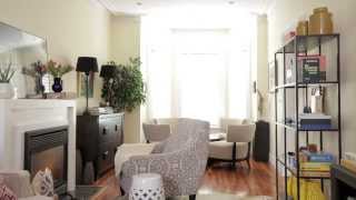 On http://houseandhome.com/tv, H&H style expert Reiko Caron faces a small space design challenge. Her solution? Careful planning — plus a furniture shopping trip to Leon’s!
Watch hundreds of other free TV segments here: http://houseandhome.com/tv.
What a disaster.
Love Love it watching from Hongkong
Nice makeover as far as style and pop of color, BUT!…if any adult sits in those huge white chairs, the table would be at their knees, and you would have to lean forward to eat or play board games at that table! Furniture was all so BIG n bulky for such narrow space! A smaller dining set w/ narrow chairs would’ve been best and complimented the Bay window more! Just my opinion!😕
Its too cluttered with the chair by the fireplace now. I like the other 2 areas but too much furniture going on.
I probably would have had a taller table because of the larger chairs or vice versa but overall I like what was done to the space. The accessories were great. That Roundhouse furniture store has a lot to offer.
Not kid friendly
Too crowded
So much happening in there…its too much….
That is way too busy! I would get anxiety.
Cluttered!
Aaah no! Too cramped up!
Cluttered
Nice , I like it
I guess that neither the designer nor the resident reads much, considering that those are all her books and the space by the fire is not a comfy reading spot. Even if most of her reading is e-books, the light from the fireplace should not be behind the book.
Furniture is too big for this space
she seems to know nothing about designing a room! the room looks so messy afterwards! as @Ninaforever17 said, there are too many chairs for such a small space!
I love this! What kind of decor style is this?
Gosh, I hate ottomans doubling as coffee tables. So impracticable. Like a dinky little tray is going to hold drinks and snacks , and the ottoman isn’t going to be stained really quickly. You could have put a L-shaped sofa in that corner. Faux or otherwise, animal hide rugs are an abomination. And lastly, there doesn’t look like there’s much legroom in that conversation area. A crescent-shaped sofa with a small round coffee table would be a better choice.
I’d like the black and white coat!
Beautiful. I love it. It looks more spacious with the decoration.
Couch is in the wrong place so then couldve moved reading chair to better place nect to fire but also to mingle with sofa
Too many chairs and too cluttered for such a small room (to be perfectly honest)
still bigger than the flat I live……
Love the cocktail area. Beautiful!!
Way, way too cramned in.
Cluttered. trying too hard. Everybody thinks that when they’re decorating, they’re going to become professional hosts. Thanksgiving and Christmas doesn’t count. Decorate for The family’s needs not for others.
I really like the final look. If the table and chair area was larger, it would be perfect.
Where are the toys?
I keep going back here.
I loved it 😀
Love it
Too much going on. Smaller chairs by the coffee table and getting rid of the bookcase would have worked. The chair next to the fireplace is too big. Looks somewhat bulky and hinders movement
feels so cluttered … looks like a flea market .. stuff that wouldn’t obstruct the traffic .. You wish…..
need some art on those walls
Terrible, too cluttered too many chairs and those white chairs already look dirty imagine what will they look in 1 weeks with kids and food hands.
so helpful and practical . I have the same kind of room and I am going to copy this
Sorry but…way too crowded and that gaming table is either too low, or space is too crowded to be able to sit on the floor around it. This was a miss.
Throw away some of the chairs sobit will more make space
A knees bumpy room…maybe two zones were all this space can take.
So, when you were going to tell us this video is sponsored by Leons?
Nah….. I don’t like the too low table on which you can’t eat nor write. It doesn’t work with the size of the too big chairs. Where are the bedrooms?
It’s too much. I like some of the individual ideas. The dresser for storage, for instance. Interesting to see a project with problems to work around, though. The long, narrow room combined with the unfortunate placement of the fireplace. Yikes.
NOTHING here looks like a "small space solution." This is clearly an ad for Leon’s Furniture, but I would think between 2 Toronto designers and a downtown furniture store someone would actually understand what small space furniture and design is. The final room is uninspired and looks uncomfortable. Actually, it looks exactly like what it is: a mini Leon’s Furniture showroom!
How much did Leon’s pay for this segment?
Excellent zoning
This is so fucking repulsive
The proportions of the furniture does not match the space. They are oversized. The chairs by the window made the space crowded. The flow is severely impeded. Not a fan.
I think it looks nice and has good ideas for a long narrow studio apartment.
It looks very crowded. No reading light for the comfy chair in front of the fireplace. Or anywhere that I can see. And not much color. Not a success.
Cost of furniture total please?
Why wouldn’t you have put a regular round table in the window with (smaller) chairs that fit underneath to save space and make it easier to player board games and enjoy light meals? Then you could have put two reading chairs in front of the fireplace.